The Missed Third Act of the Apple Touch Bar
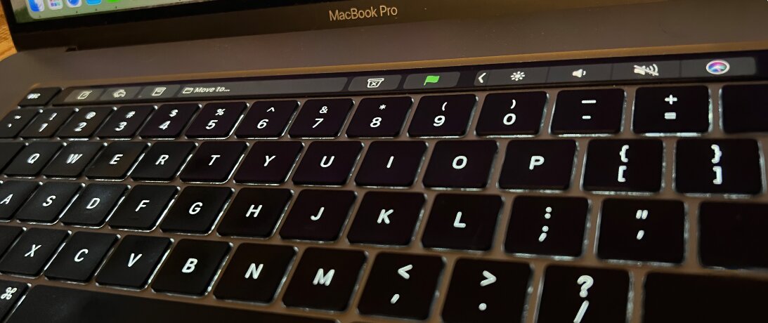
I’m a bit of a contrarian on a lot of things, but usually I understand the opposing majority. With the critics of the Apple Touch Bar, though, I am stumped. While the new 14” and 16” MacBook Pros portend an exciting new era for Apple users, I mourn the little keyboard touch screen it comes at the cost of. It didn’t need to die.
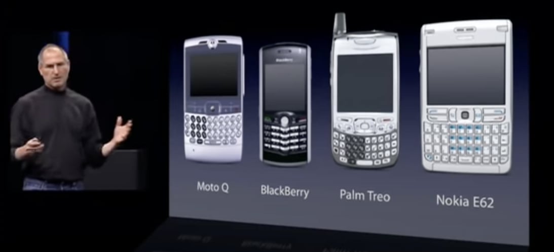
I happened to rewatch Steve Jobs’ original iPhone unveiling the other day as part of preparing for the latest Zippy podcast episode. It felt ironic juxtaposed to Apple’s quiet purge of the Touch Bar. In the exquisitely crafted buildup to unveiling the iPhone, Jobs pointed to competitors and their tiny QWERTY keyboards. Here’s what he said:
They all have these keyboards that are there whether you need them or not and they all have these control buttons that are fixed in plastic and are the same for every application. Well, every application wants a slightly different user interface, a slightly optimized set of buttons, just for it. And what happens if you think of a great idea six months from now? You can’t run around and add a button to these things. They’re already shipped.
Critics scoffed at Jobs’ soft keyboard solution on the iPhone. No one could ever type decently on that poor replacement for the Blackberry’s exquisite keyboard!
(Those critiques didn’t fare well over time.)

I love a good keyboard as much as the next guy, but having a keyboard that could disappear and buttons that could be contextually correct simply is worth the tradeoffs on a tiny device.
Laptops are a different matter and the Jobs era was one of careful refinement, not elimination, of Apple’s laptop keyboards. The infernal adventure into so-called butterfly keyboards was a post-Jobs form-over-function affair and the Touch Bar suffered guilt by association.
Consider both through Jobsian design philosophy:
People think it’s this veneer —- that the designers are handed this box and told, “Make it look good!” That’s not what we think design is. It’s not just what it looks like and feels like. Design is how it works.
The way we use the alphanumeric and function keys on a keyboard are quite different. We pound letter and number keys repeatedly by feel when touch typing, so tactility is paramount. The butterfly keyboard failed the “Design is how it works” test, trading an appearance problem for a how-it-works problem.
The Touch Bar isn’t just for looks; it also solves a how-it-works problem in the more cryptic regions of a keyboard. The “F8” label tells me nothing about what it does, say, in Adobe Photoshop.
Diverting F-keys to be “multimedia keys” has been a decent solution for most users, but limits the utility of a significant part of a laptop’s real estate. While in Word, one sixth of the control area of my computer is devoted to functions like “play” and “pause” rather than “bold” and “italic.”

The Touch Bar made that sixth of the keyboard constantly applicable.
The first take wasn’t perfect. The frequently useful “escape” key was unhelpfully subsumed into the bar. So too the power/Touch ID button. Revision 2, which premiered alongside the elimination of the butterfly keyboard in 2019’s 16” MacBook Pro, solved those issues, returning the “escape” key and making Touch ID its own key, too.
It was good.
That good Touch Bar remains for now on the M1 13” MacBook Pro and, of course, won’t suddenly vanish from the computers of those of us who already have it. But, in some sense, it will vanish victim to its mutable nature. Its utility depends on apps supporting it, but without a clear future, developers will scratch new feature plans and too-soon dump even existing code, citing the burden of maintaining a “legacy” tool.
I will miss it. For example, in BBEdit, I quickly toggle through the open documents using those contextually aware buttons. And pressing down on the volume button and immediately using it as a volume slider is a fantastic way to get sound “just right.”
I do sometimes “misfire” and hit it when I don’t intend — it isn’t perfect — but when rumors of its death emerged, I hoped they were exaggerated. I hoped, instead, for a third-generation bar.
What 3.0 would look like is easy to imagine. Art.Lebedev Studio stunned many of us back in 2005 when it showed off the Optimus Maxmius keyboard that put a small screen under each key. A keyboard able to morph for different languages or applications! Though the Optimus was delayed, hard to get, expensive and, reportedly, flawed in implementation, the concept remains fantastic.
A few years later, I reviewed an ingenious entry into the text-friendly-but-not-smart phone market that Samsung released just before going all-in on Android with the Galaxy S. The Alias 2 keypad was like a more practical, phone-sized Optimus, utilizing low energy e-ink displays under the keys rather than power hungry LCD’s. Brilliant. While soft keyboards on phones proved better for general phone usage, it offered as good of answer as anyone ever did to Job’s quip that you “can’t run around and add a button” to previously shipped phones.
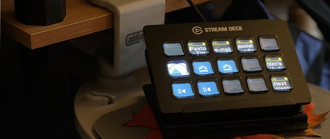
More recently, the Elgato Stream Deck (affiliate link) has proven the concept in a more limited form like that of the Touch Bar, offering several purpose built “keyboards” that contain a limited number of keys meant to be customized for live streaming and other similar tasks. Each one has an LCD that shows what it will do and can change depending on status — for example, whether one is live right now in OBS or not. Ask any serious live streamer you know, and it is likely they have one of these indispensably handy tools. (Stream Deck works nicely for non-live stream tasks, too, incidentally… like a Touch Bar.)

Whether with e-ink like the Samsung phone of old or LCD, a row of Stream Deck-like physical, dynamically changeable keys, made contextually aware like past Touch Bars, would have satisfied the critic and Touch Bar believer alike. The perfect concept-made-better way to move on from the Touch Bar.
Instead, it looks like the future of the Mac has us partying like it was the 1980’s again with normal function keys. They’ll be fine; they always have been.
But, they could have been more.

Timothy R. Butler is Editor-in-Chief of Open for Business. He also serves as a pastor at Little Hills Church and FaithTree Christian Fellowship.
You need to be logged in if you wish to comment on this article. Sign in or sign up here.

Start the Conversation