
The train ride was from whatever station is near Hamilton to Boston and back. I was in eastern Massachusetts for a horse show, but was taking a day off to do some work, namely visit the new digs of Miguel de Icaza and Nat Friedman, two of the brighter stars in the Linux firmament, and to interview them.
They were great to talk with, and the steampunk décor at their new company, Ximian, was bracing. I’d probably remember it pretty clearly even if that were the only thing that day which was out of the ordinary. But it wasn’t.
There was a stunt aspect to the trip, in the early part of the millennium. I’d gotten Linux and the then-new and still-good KDE desktop to run on the ultra-dinky Toshiba Libretto 70CT sub-notebook computer. So I thought I’d write that week’s edition of my little column on the Linux Planet website on this super-small computer, while on the train to and from Boston.
Which stunt was made possible by the arrival, finally, of a good Linux word processor. It was called TextMaker and was published in Germany by the SoftMaker company. There were already word processors for Linux, found in the largely okay but low-powered Applix Works program, and the awful-no-matter-what-platform WordPerfect for Linux. (Emacs people may now take their medication and go back to sleep.) TextMaker was something new, a Linux word processor that was both powerful and easy to use. It was my word processor of choice for years, and I still have a recent version of it on my desktop machine and pay to upgrade it from time to time. It really was and is a lovely thing. (I confess that I’ve migrated to LibreOffice for most jobs because its files are closer to the unhappily standard Microsoft formats.)
Following my mad-scientist gadgetude in response to the illness of my old iPad Mini 2, as somewhat detailed here (and after listening to the advice of OFB’s Tim Butler, who knows more about Apple products than I ever will), I broke down week before last and ordered the cheapest new iPad. (I considered refurbished models, but the difference in price between new ones and repaired ones was so little that it cost, really, nothing to enjoy the unboxing experience made vicarious in a million YouTube videos.) Looking at old receipts, I learned that it was $150 cheaper than my now-dying iPad Mini was eight years ago. It is of course far more powerful than the old one. And bigger, meaning that its range of potential uses is greater.
When I got the Mini four-fifths of a decade ago I also got a Logitech keyboard-case for it, which I very much liked. IPads need cases. A case that also has a built-in keyboard is especially attractive to someone who writes and makes pictures for a living (the very sharp Retina display makes the iPad attractive on the photography side). A couple of years ago my inattention sent the iPad Mini in its keyboard-case flying from the couch to the floor. The iPad survived unscathed — even now, externally it looks brand new — but it landed such that one of the keyboard-case’s corner clips was irreparably broken.
Now, with a new iPad that was big enough to serve as a legitimate laptop-computer replacement, I sought and found at a good price an open-box Logitech Slim Folio keyboard case for it. Apple has its own keyboards, but the Logitech is so good it is even sold, too, by Apple. (I didn’t get any pens, pencils, crayons, or expensive trick earbuds.)
To continue what is a long digression (surprised? I didn’t think so), I must mention how easy it is to migrate everything from an old iPad to a new one. It can be done by an iCloud backup or device-to-device. I thought I was doing the latter, but it turned out I did the former. Anyway, after three hours, two of which were due to a hiccup that I didn’t notice for awhile, everything on the old Mini was now on the new iPad. I opened a browser and found that the tabs I had open on the old machine were open on the new one. Amazing. (A couple of security-conscious applications insisted on my jumping through small hoops to transfer their configurations to the new gadget, but this was easy — and reassuring.)
I suppose there’s a reason behind it (if there is, it defies discovery), but it annoys me that people go to great expense to develop good products only to fall short in documenting how they are used. The keyboard-case is an example. It apparently has many powerful features, but its instructions were in hieroglyphics on a tiny scrap of paper; I needed to take to the internet to find out how to pair the thing with the tablet. That was a small inconvenience. There were big inconveniences to follow, which I detail below.
I went to the App Store to pick up a good word processor. I was prepared to pay a few dollars, if necessary, for one. (I remember all too well the days of $300 word processors and still have one of the few paid-for copies of “Signature,” IBM’s method of destroying the previously well-respected XyQuest company.)
What I found at the App Store’s word processor section was as great a collection of concentrated insanity as you can find anywhere outside Washington D.C. Part of it is due to the mistaken — please God, I hope it’s mistaken — idea that people are publishing magazines, catalogs, and brochures from their cellular telephones, and the resulting attempt to make complicated features available on programs for screens half the size of a postcard. Much of it is due to developers having lost sight of what word processors are there to do, which is to process words. If you look at the word processor section of the App Store, you’ll see picture after picture of pages filled with photographs and graphics — and none of pages filled with words. Everyone thinks their app is the new Aldus PageMaker for tiny telephones. It’s insane! (And that’s before you realize that much of what’s there is not to process words but to process money from your pocket to the publisher’s though various bizarre schemes.)
You might think — I did — that this is just bragging, companies showing what their programs can do, and that you don’t have to do all that. You can just use the products as ordinary word processors. That part is surely simple to achieve.
Nope.
Apple discovered a few years ago that tablet computers are not the same thing as telephones. It would serve applications developers well were they to make the same discovery. While they’re at it, they might look at something that began life as IBM’s CUA — common user access — menu standard. This was formulated so that you could find your way around pretty much any program. None of the dozen or so “word processors” I downloaded from the App Store and mostly deleted soon thereafter adhere by default to any sort of standard. Not a one. A very few do hide configuration options behind hieroglyphics where they can ultimately be found; many don’t do even that. It would be okay if the programs were well documented, but as with the keyboard-case, they’re mostly not.
A problem with all of them — not their fault — is the iPad OS way of handling files, which runs counter to the file hierarchy known to users of big-boy computers. In the olden days, we ridiculed people who intermingled their own files with program-supplied ones. While that’s not required in the Apple system, it’s close. The issue is exacerbated by Apple’s strong encouragement to put your documents on their cloud. Even if you think that this is a good idea in principle, as I do not, iCloud has not over the years proved the most secure of places.
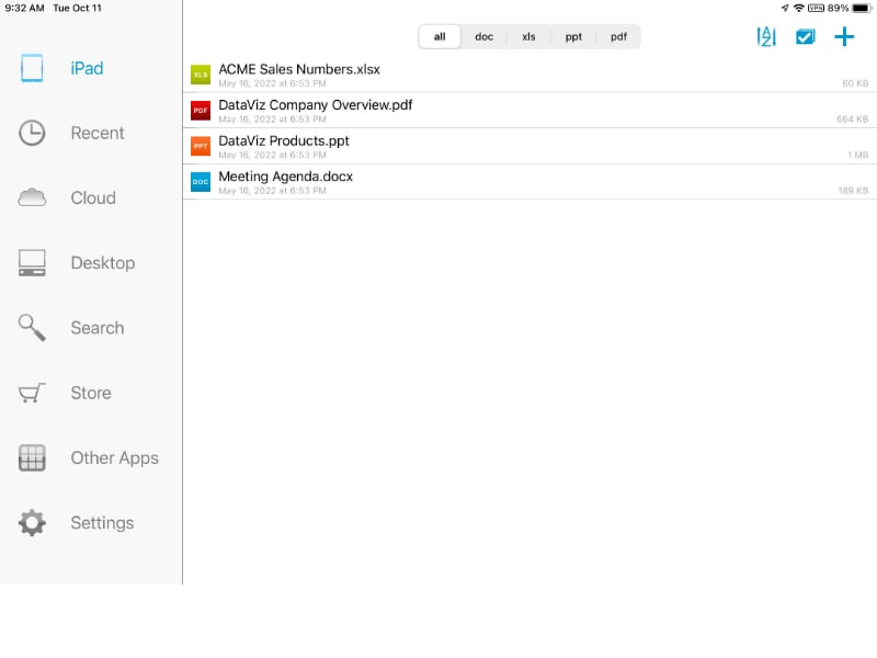
Before long — well, that’s not true; it took hours — I’d narrowed down the possibilities, the potential “keepers.” Theses included Pages, the non-awful Apple word processor that is included with the iPad; WPS Office, one of those good-sounding, semi-free apps I’ve had on other devices; Docs to Go, which I’ve had on every tablet I’ve owned, for more than a decade; and a surprise.
I’ve spent a while, not long, trying to put Pages in order, and failing in the attempt. It seems to do things in a way that makes sense to Apple folk, and I have no reason to criticize that beyond saying that it does not fall naturally to me. Perhaps one day, out of need or the desire to learn something new, I’ll try to understand that frame of mind, but for now it and I coincide practically not at all.
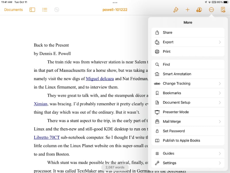
WPS has to me always looked better than it was. I have no doubt that it makes sense to some set of users, but I’m not among them. I carried it around on my Mini, but it was with the comical idea that it was there for the day there was something I was so desperate to write that I’d endure figuring out WPS in order to do it. That day never came. It could not find any existing files on the iPad when I tried it now. As a result, no one can find WPS on my iPad, not anymore.
The reason I’ve carried Docs to Go around all these years is that it was gorgeous on the H-P TouchPad of brief memory. The designers and programmers made great use of the features of its WebOS, which was ahead of its time and which can now be found mostly, maybe exclusively, on LG-brand televisions. DtG never again achieved (or had available from subsequent operating systems) the same level of pyrotechnics. And there is something about it — its name is even a little off-putting — that rubs me the wrong way. Plus, it has a hard time finding files it did not itself create.
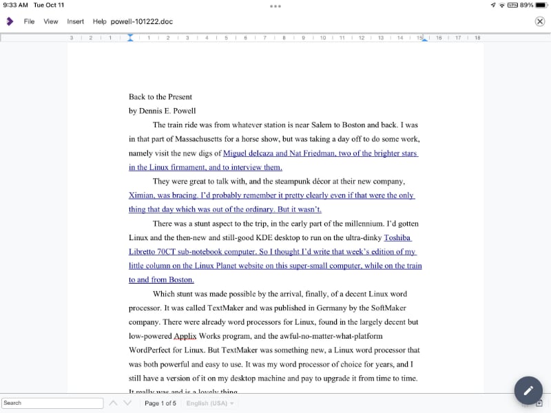
There is no LibreOffice for i-things as such, but there is its allied enterprise, Collabora Office. The company wants money, an amount I could never quite figure out, though it seems to be $20 per year, for me to use it. ‘Fraid not, even though it isn’t awful to look at.
One of the problems with many word processors is that at installation they have everything turned on, so the first set of tasks is turning off unnecessary features that are all over the place, like malware on preloaded Windows. Every application has its own way of doing this. It is maddening.
This was true even on the surprise word processor I found in the app store; the defaults were so troubling that I nearly deleted it. I’m glad I didn’t.
Instead, I am writing this in it and there’s some irony in that, inasmuch as the application in question is . . . TextMaker. Yup, a modernized iOS version of the word processor that made Linux work well for me a couple of decades ago. I’m fairly familiar with it in general and firmly familiar with all the things I need regularly to do with it. Problem was, when I fired it up on the new iPad it was unrecognizable to me. It had these strange expanding and contracting things — it calls them “ribbons,” I think — where in a righteous world menus are found. But after a period of jiggery-pokery my luck kicked in and deep in a master setting screen — at least it has one — I found a drop-list that promised “classic menus” or words that implied as much. I chose that, restarted TextMaker, and the world was bright and beautiful again. My new iPad now had a word processor that looked and acted like a word processor.
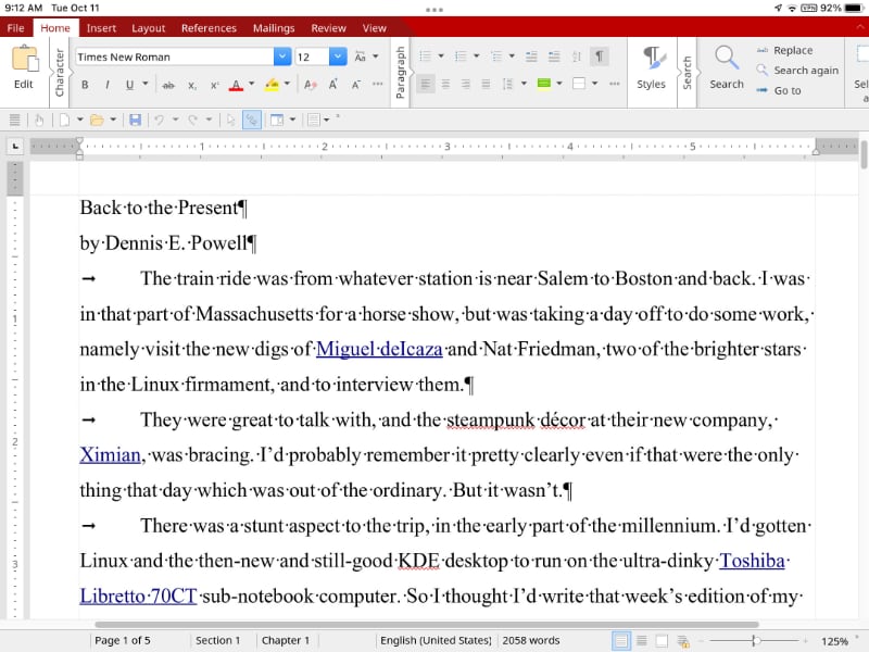
There is one somewhat though not overly flaky aspect to TextMaker for the iPad (and I guess iPhone, though I don’t imagine it being very useful there): it is free, but unless you subscribe for a few dollars a month you cannot print from it, add comments to the text, or export documents as PDF files, making it crippleware. I don’t do those things frequently, but if there were a paid version that was uncrippled I’d get it, just to support SoftMaker. (Hey, I sprang $20 for Scrivener in the forlorn hope that it will oneday be good for something I need to do!) But I do not do subscription software, which seems to be the main hook of much software for the iPad (nor would I use online productivity software even if it didn’t have the odious name of Google or Microsoft attached to it).
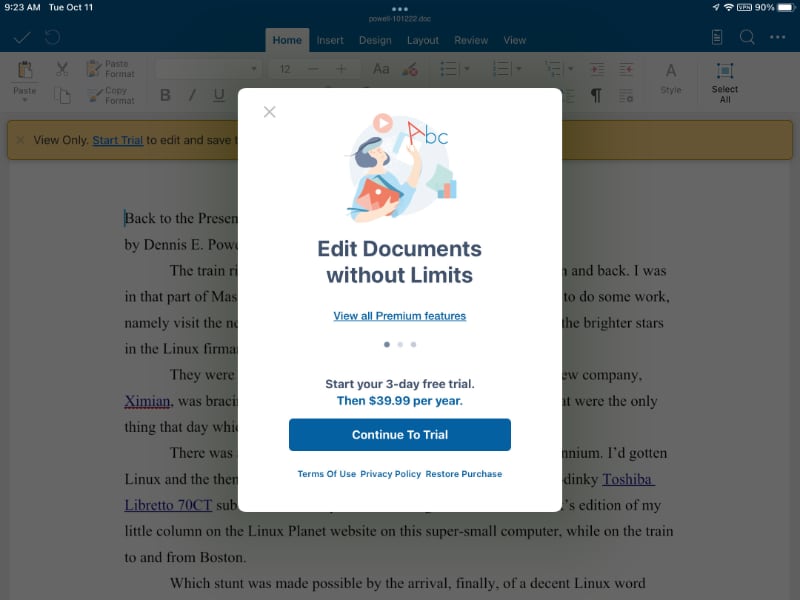
Something I just discovered would have saved me a lot of time if I’d seen it and opened it earlier: TextMaker comes with a document, a sort of gussied-up README file, that explains how to turn off the “ribbons” and turn on the menus. (It also comes with a 666(!)-page manual, so it’s not short on documentation.)
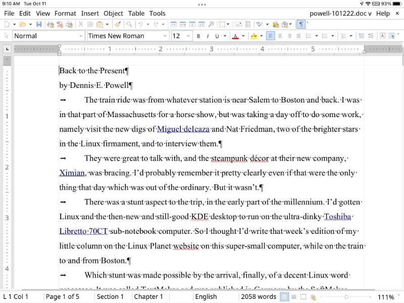
With it, my new iPad feels like a real computer. And I feel as if I’m on that train from Salem to Boston.
Sometimes progress comes from going back 20 years, it seems.

Dennis E. Powell is crackpot-at-large at Open for Business. Powell was a reporter in New York and elsewhere before moving to Ohio, where he has (mostly) recovered. You can reach him at dep@drippingwithirony.com.
You need to be logged in if you wish to comment on this article. Sign in or sign up here.
Start the Conversation